Özagro Frego marks a new chapter in agricultural solutions. Launched in October 2023, we created a lasting and versatile identity that conveys trust and innovation built to scale across every touchpoint.
Özagro Frego marks a new chapter in agricultural solutions. Launched in October 2023, we created a lasting and versatile identity that conveys trust and innovation built to scale across every touchpoint.
Project Snapshot
Brand Identity Design
I conceptualized a logo that balances tradition with modernity.
Visual Strategy
I developed a symbolic language that captures the brand’s values of growth and sustainability.
Design Concept
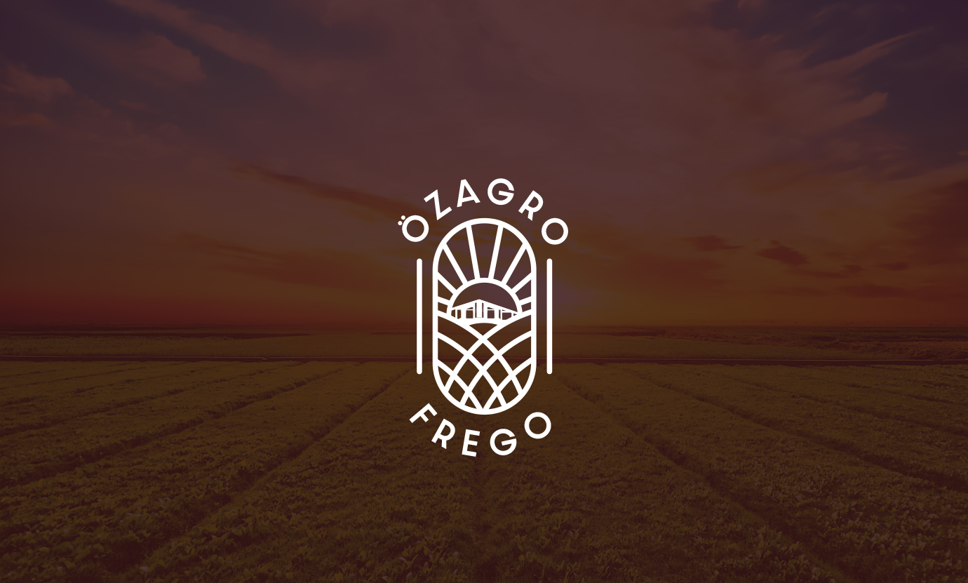
The visual story is based on authenticity. The central farmhouse icon is not a generic stock image but a stylized version of Özagro Frego’s actual guest house in Tekirdağ. This detail links the brand identity to its physical roots, fostering a personal connection between the company and its heritage.

The logo of Özagro Frego
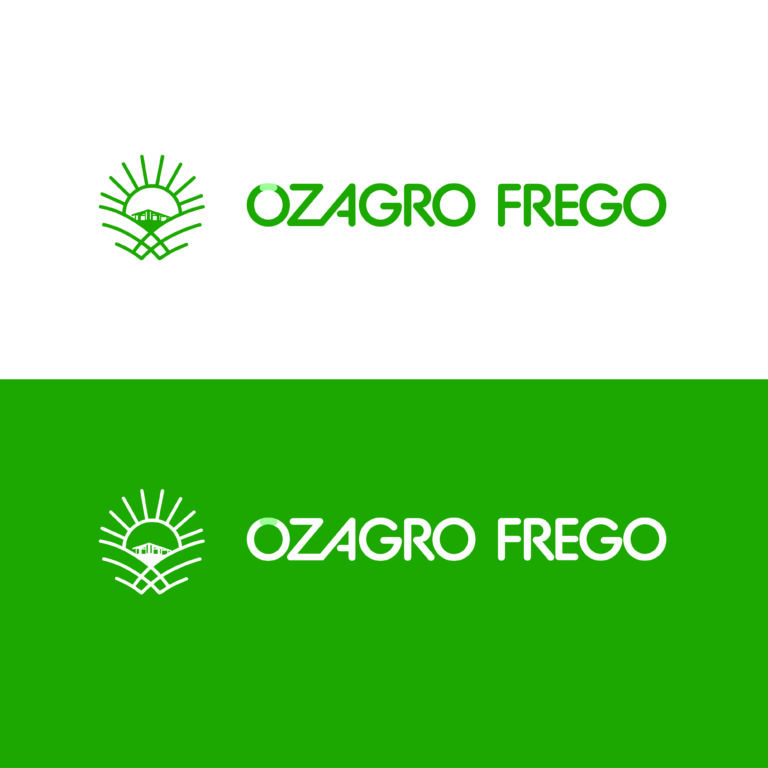
Alternative logo designs
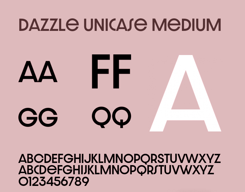
Used font for Logotype
App Icon Version
Symbolism & Semiotics
I crafted the logo to serve as a visual metaphor for the agricultural cycle
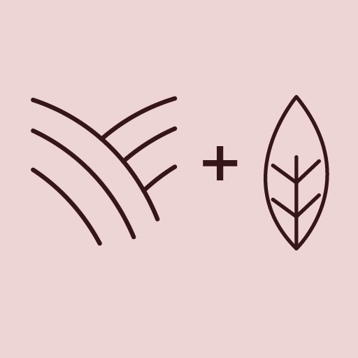
The Fields & Wheat
The lines representing cultivated fields come together at the center to form the shape of a wheat ear and a leaf. This combination symbolizes nourishment, vitality, and agricultural strength.

The Rising Sun
Located above the farmhouse, the sun supports a story of optimism, progress, and a bright future for the industry.
Color Strategy
Instead of the usual “eco-green” clichés, I chose deep Dark Brown as the primary brand color. This choice represents the soil itself, the foundation of agriculture. It highlights the brand’s reliable nature and emphasizes the organic source of its products.

Sample vehicle wrap

Business card sample
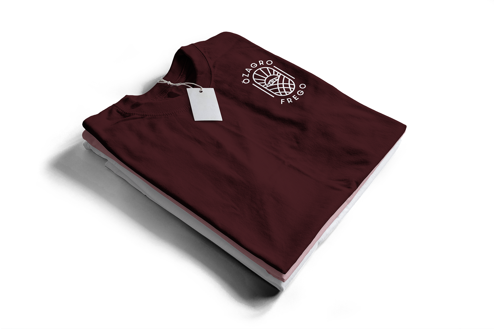
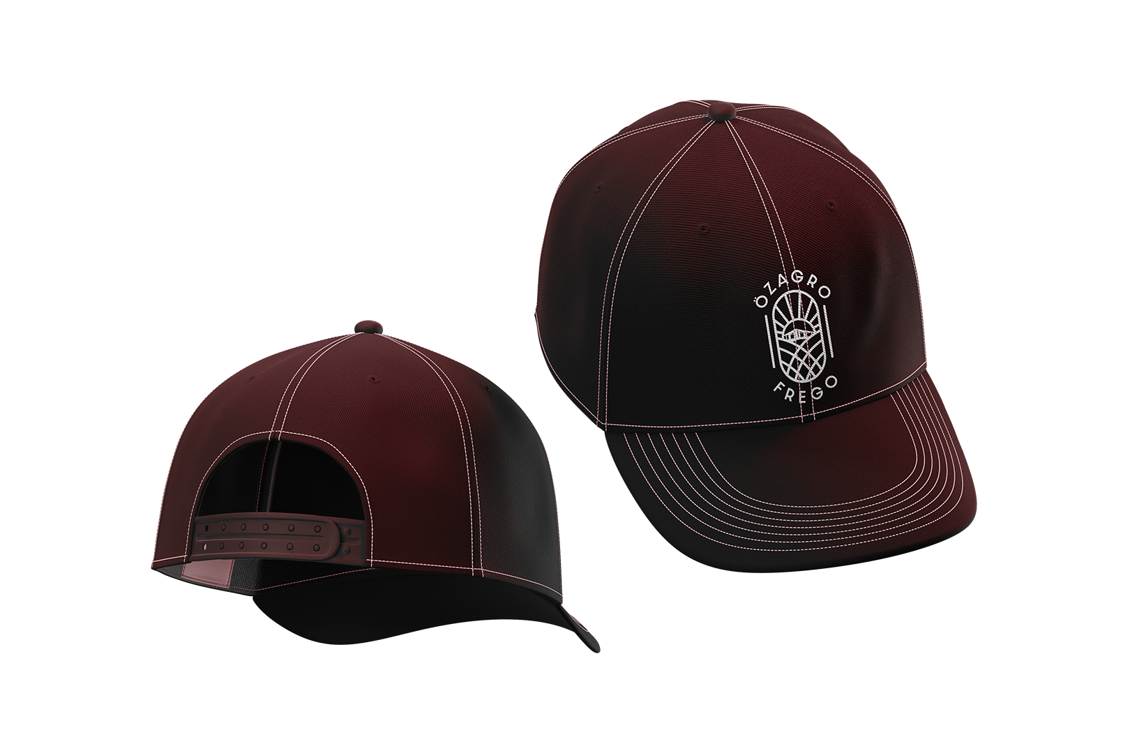
Hat and t-shirt samples