×
![Full View]()
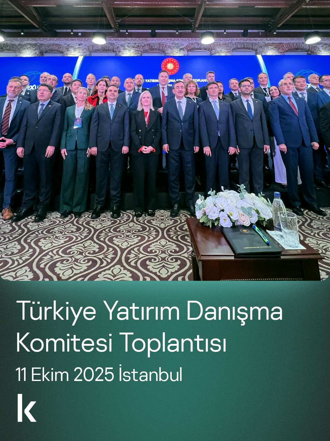
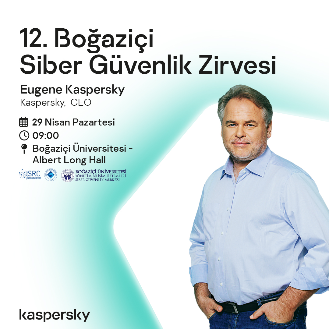
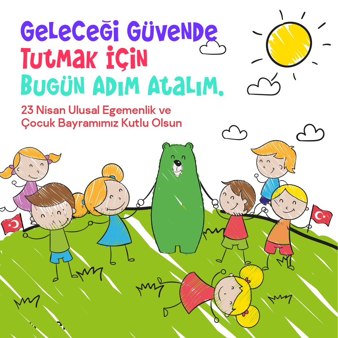
Corporate
Two professional visual styles designed for flexibility and clarity in official communications.


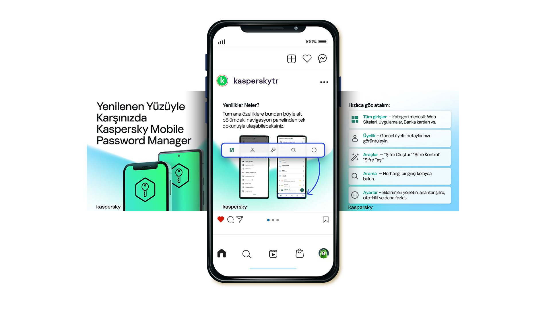
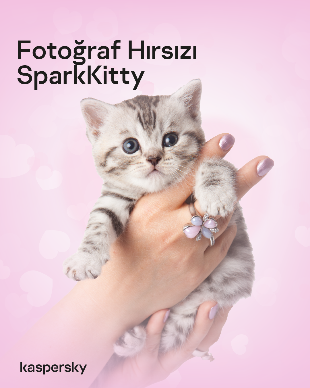
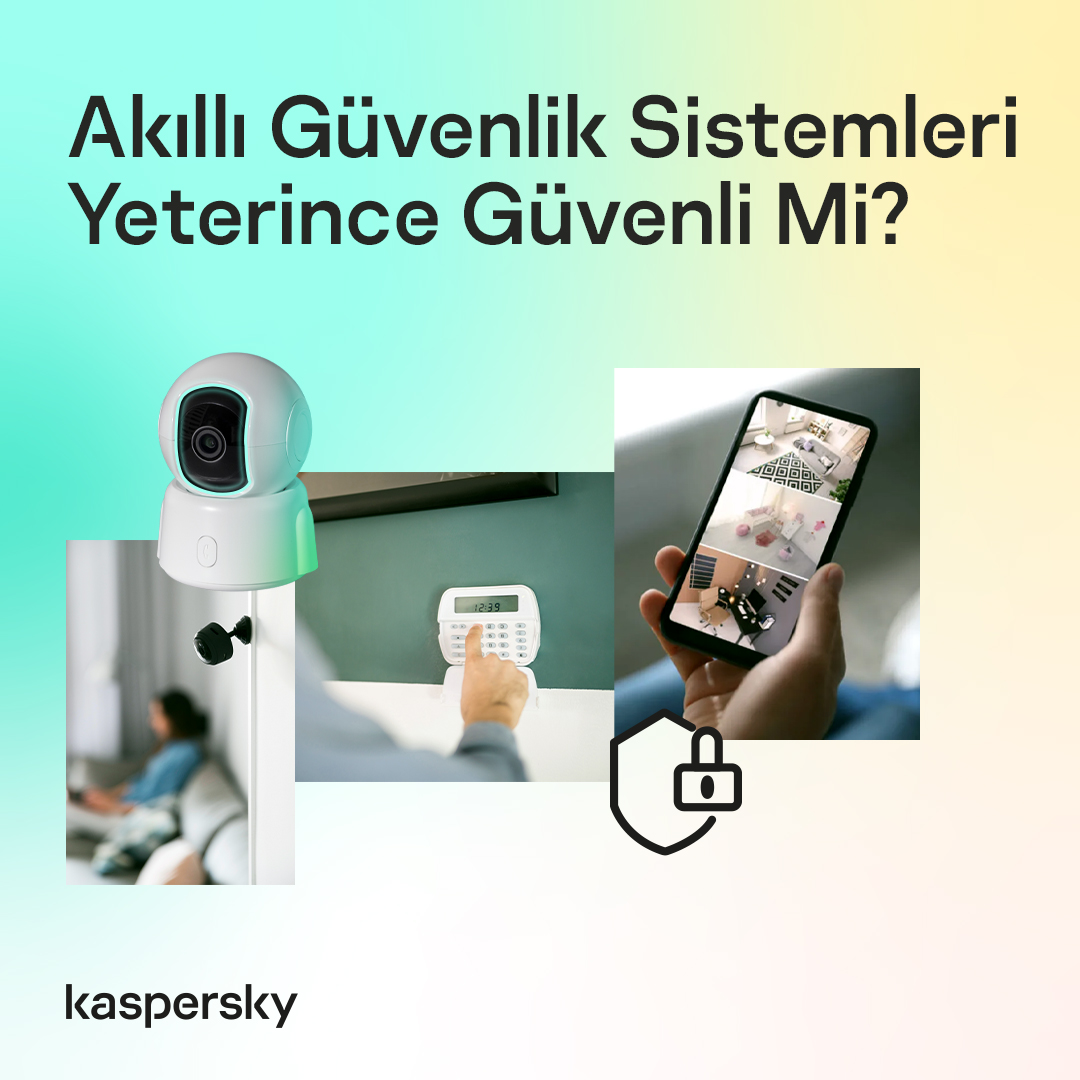
Daily Lifestyle
A modern layout combining relatable lifestyle photography with dynamic backgrounds to soften the tech heavy image.
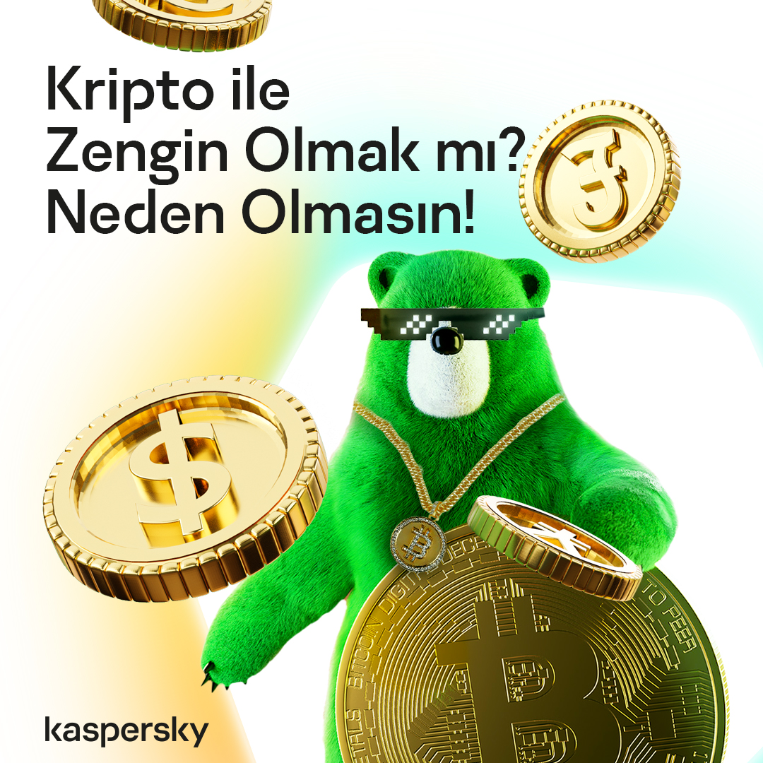
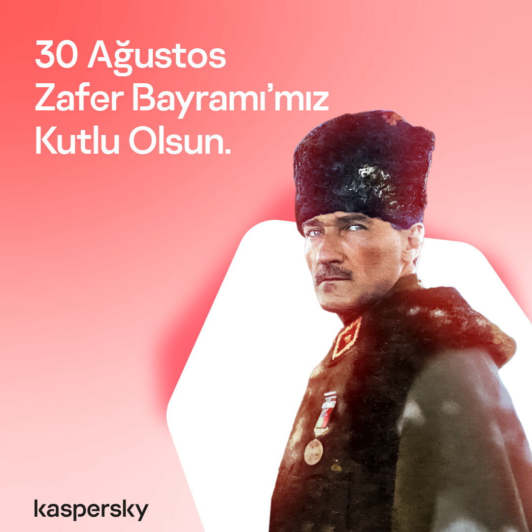
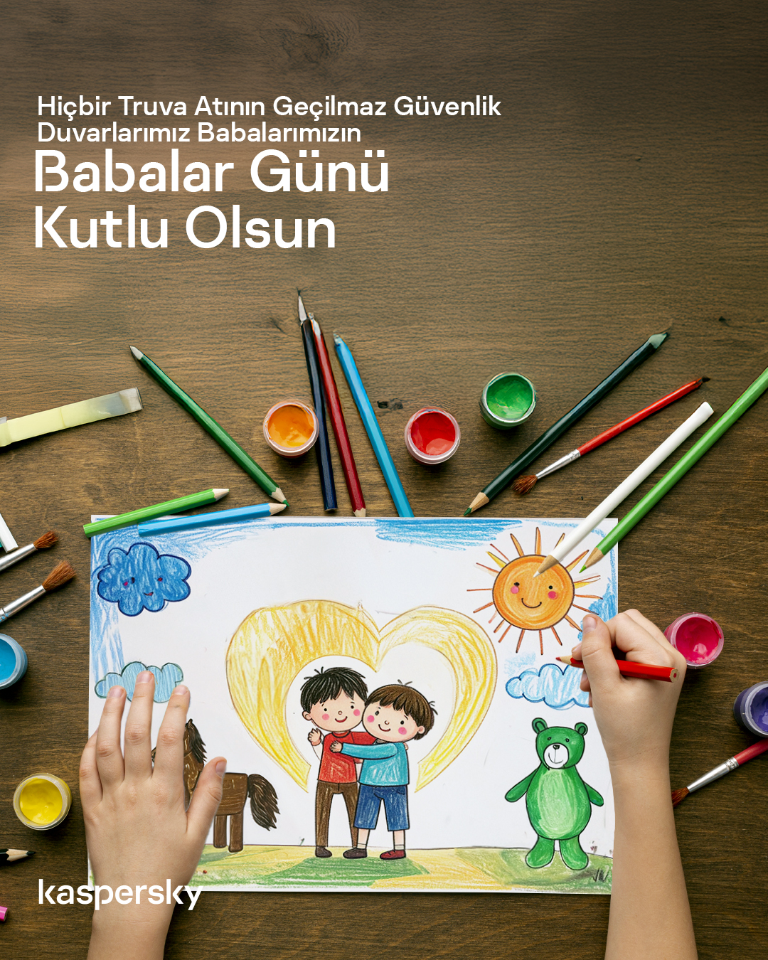
Daily Cultural Moments
Dedicated templates for special days and holidays to maintain brand relevance in local conversation.
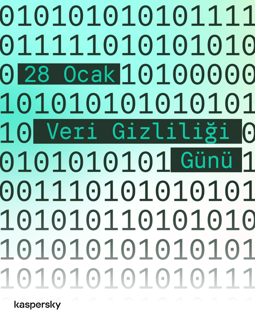
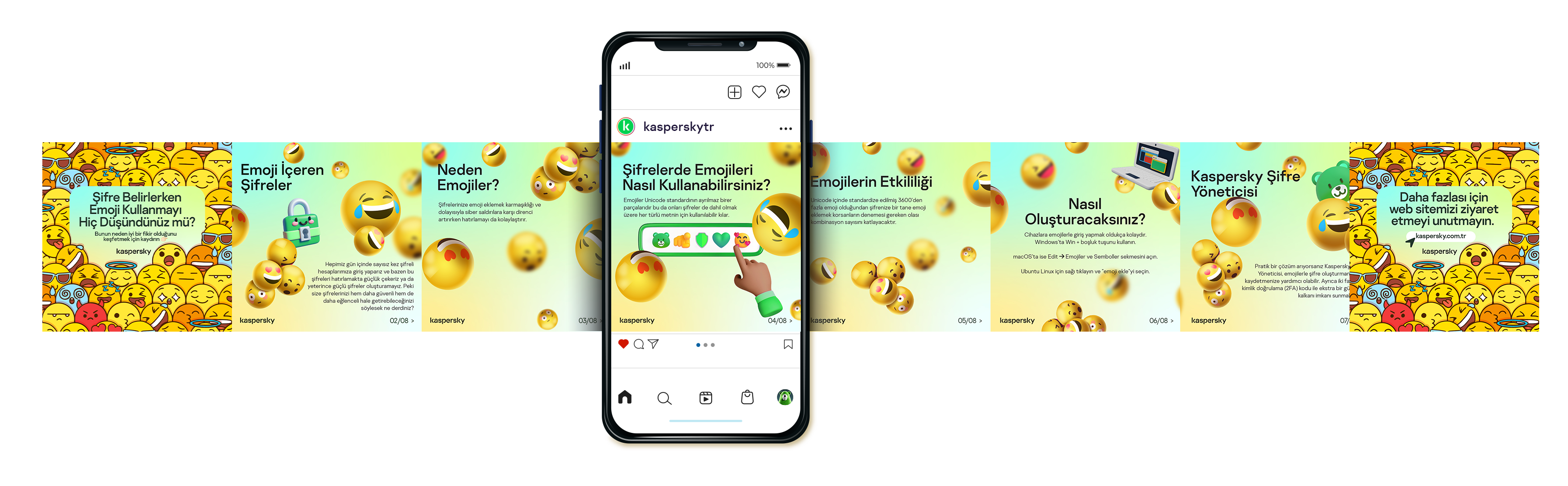
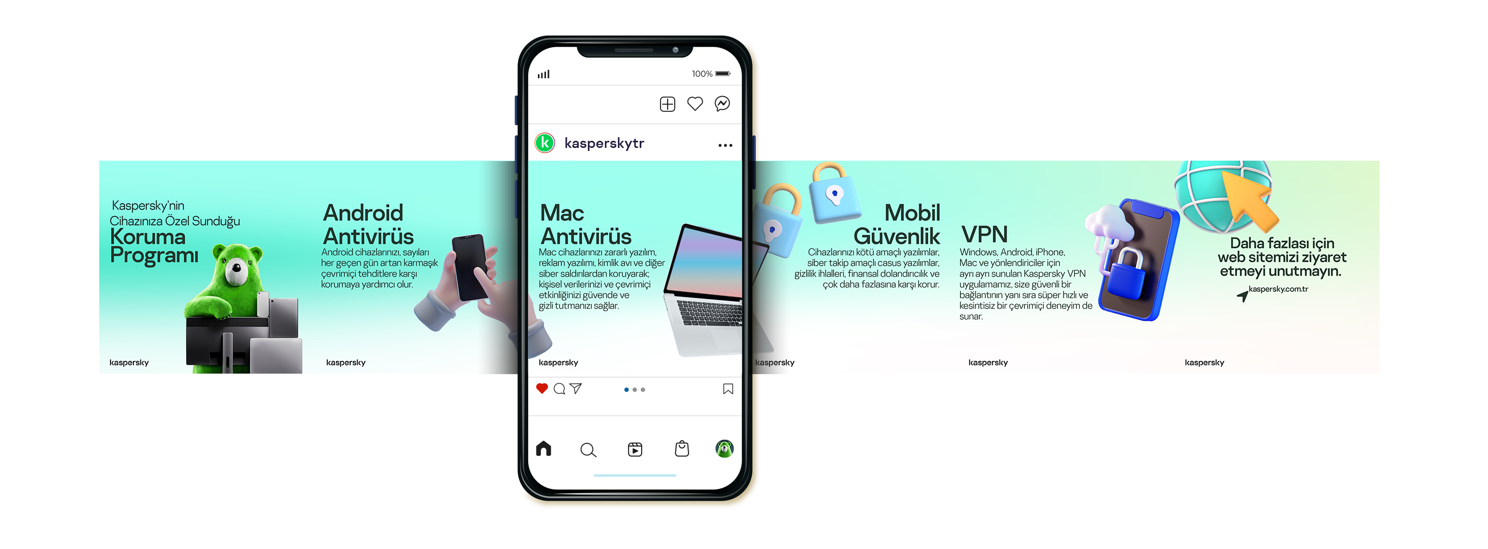
Daily Carousels
A seamless, scroll friendly format designed specifically for multi-slide educational content.